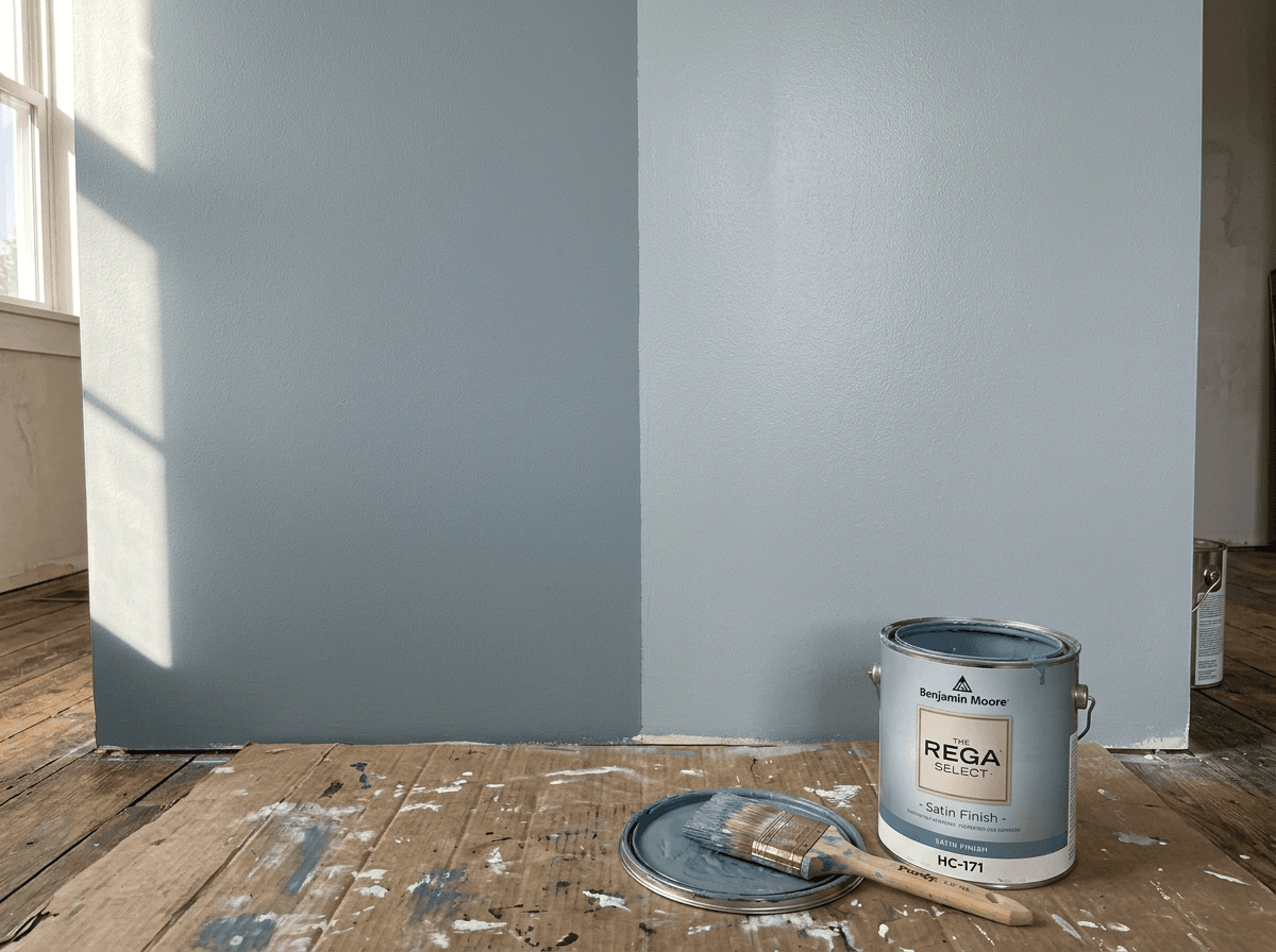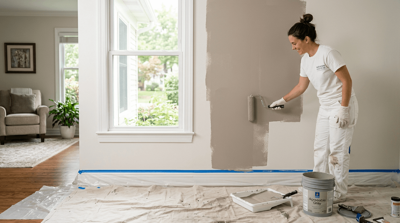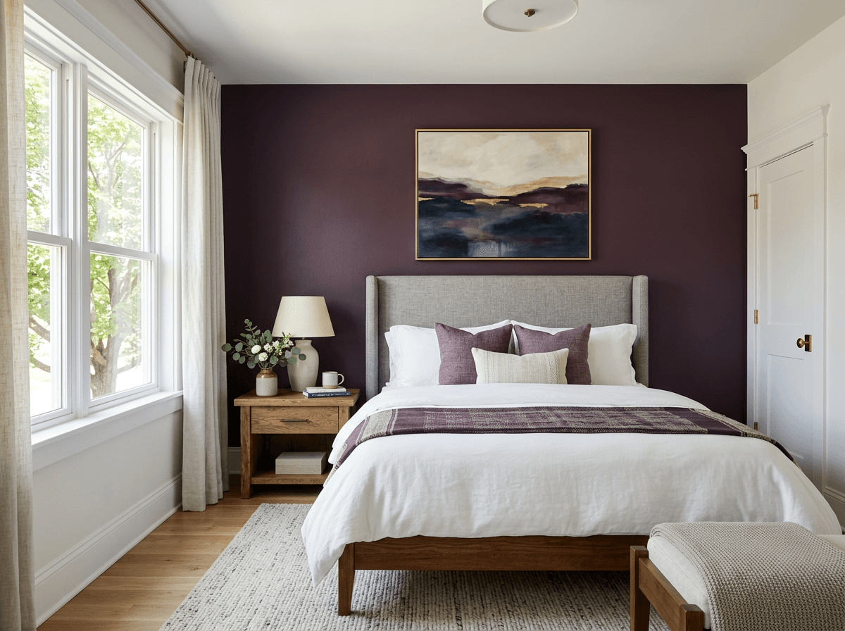
You loved the chip in the store. On the wall, it looks gray, or too yellow, or twice as dark. You're not imagining it — and it's easy to avoid.
1. Light direction changes everything
North-facing rooms get cool, indirect light that pushes colors toward blue and gray. South-facing rooms get warm light that makes colors look brighter and warmer. With long Michigan winters and gray skies, north-facing rooms can look especially flat.
2. Bulbs matter
Warm LED bulbs (2700K) make colors look yellower; daylight bulbs (5000K) make them cooler. Check samples under the bulbs you actually use.
3. Samples are too small
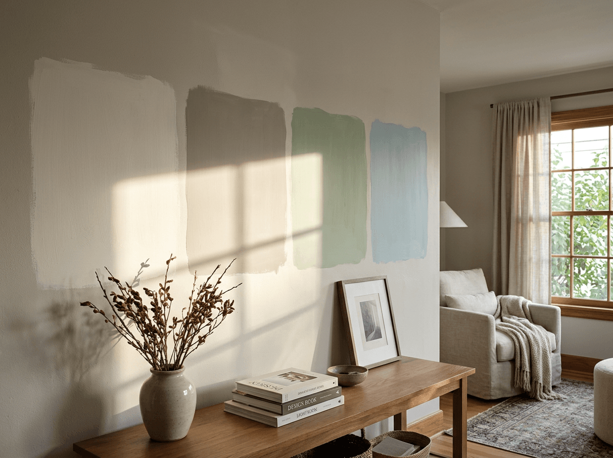
A 2-inch chip can't show how a color behaves across a whole wall. Colors almost always look darker and more saturated in large areas. Use large painted sample boards and move them around the room.
4. Sheen shifts color
Glossier sheens reflect more light, so the same color in satin can look lighter than in matte.
How we help
On larger projects we provide a free color consultation with sample boards so you can see colors in your own home before we start.
Frequently asked questions
Planning a project? Learn more about our interior painting services or ask the Paint Pro.